A dynamic, unified brand for the Simons Foundation.
About
The Simons Foundation advances research in mathematics and the basic sciences. Founded in 1994 by Jim and Marilyn Simons, it supports curiosity-driven work through grants, programs, and public engagement.
Challenge
Clarify how many programs fit together and present them as one coherent foundation. Preserve each initiative’s character, create clear wayfinding across the organization, and equip the communications team with tools that work in print, web, events, video, and social.
Solution
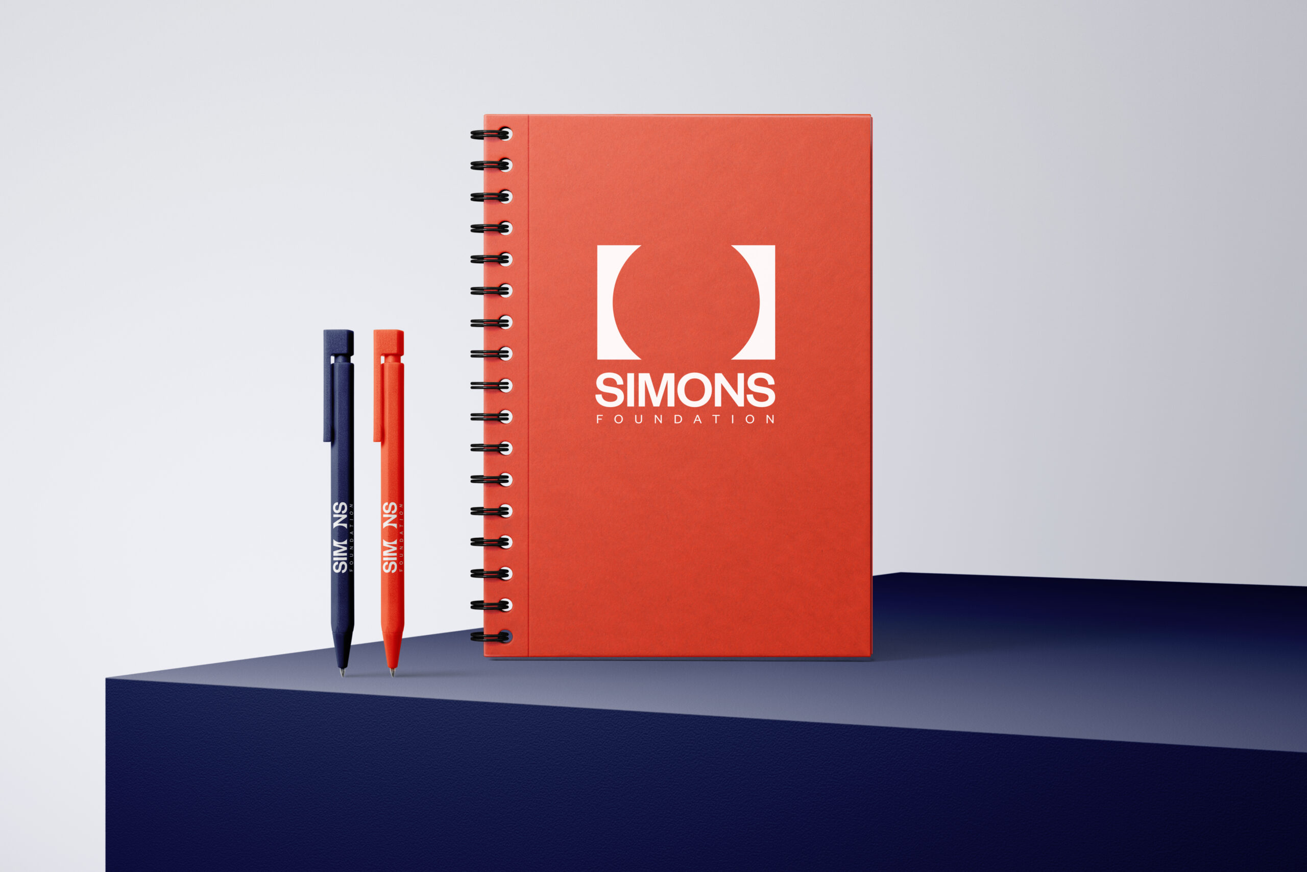
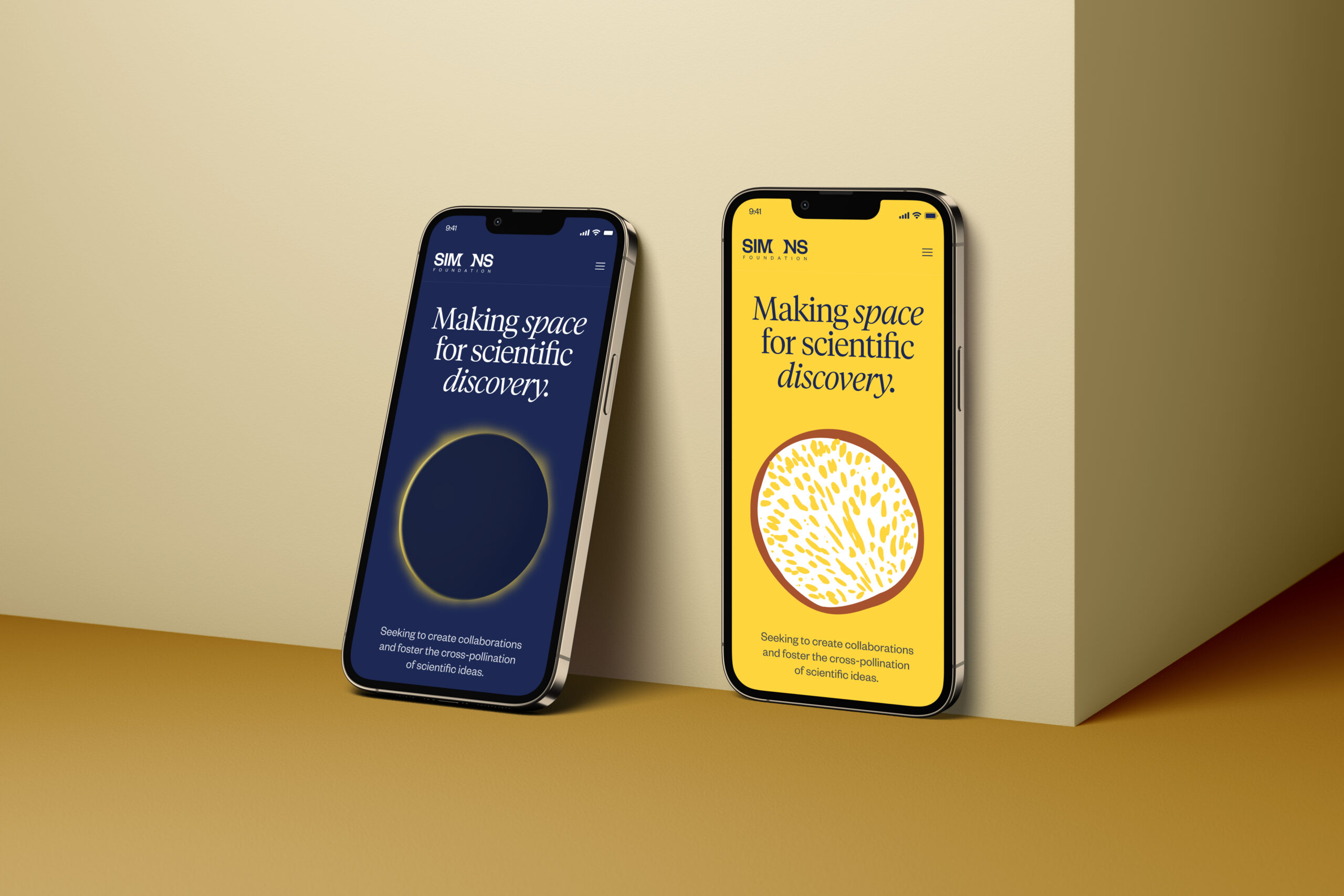
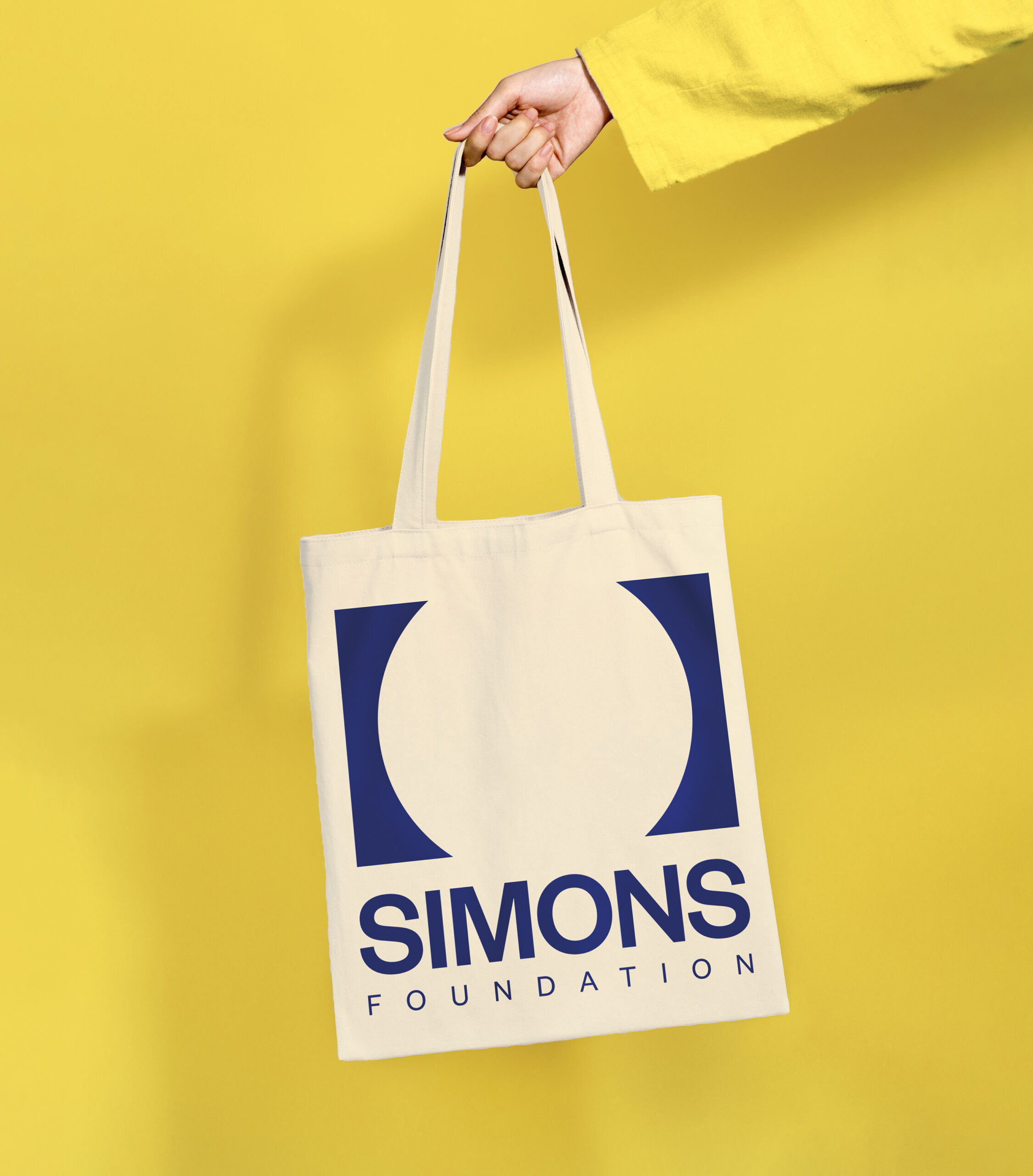
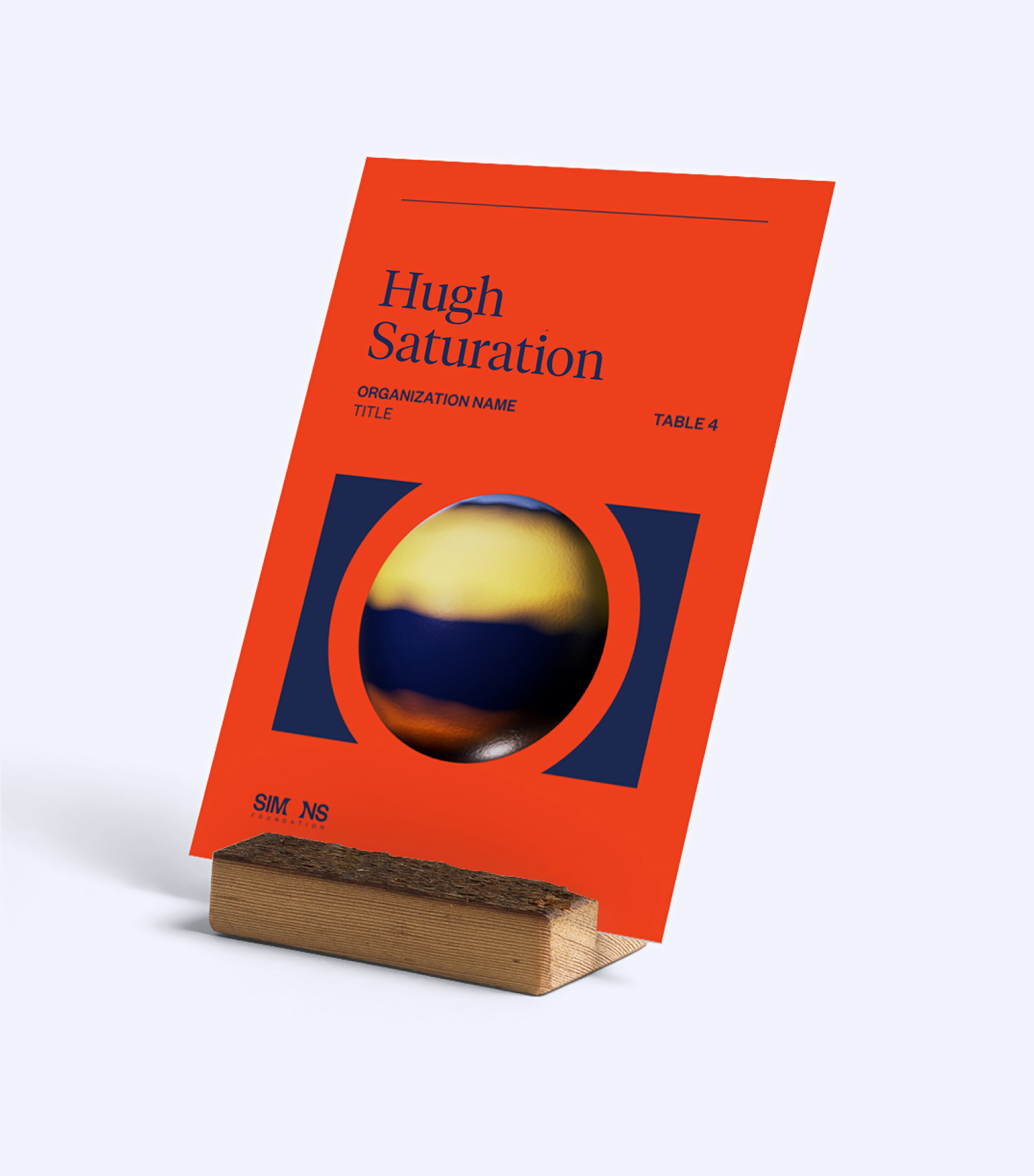
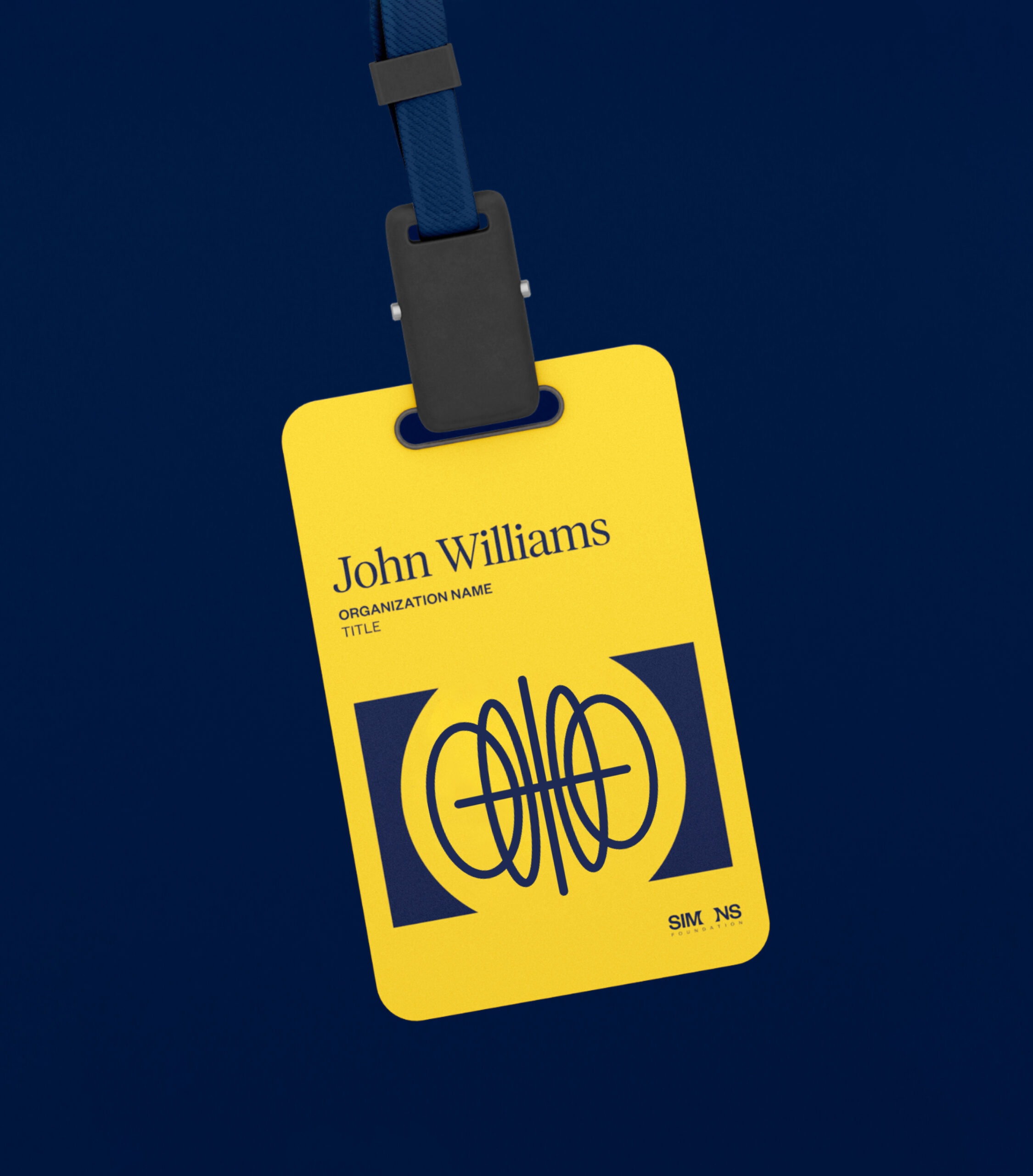
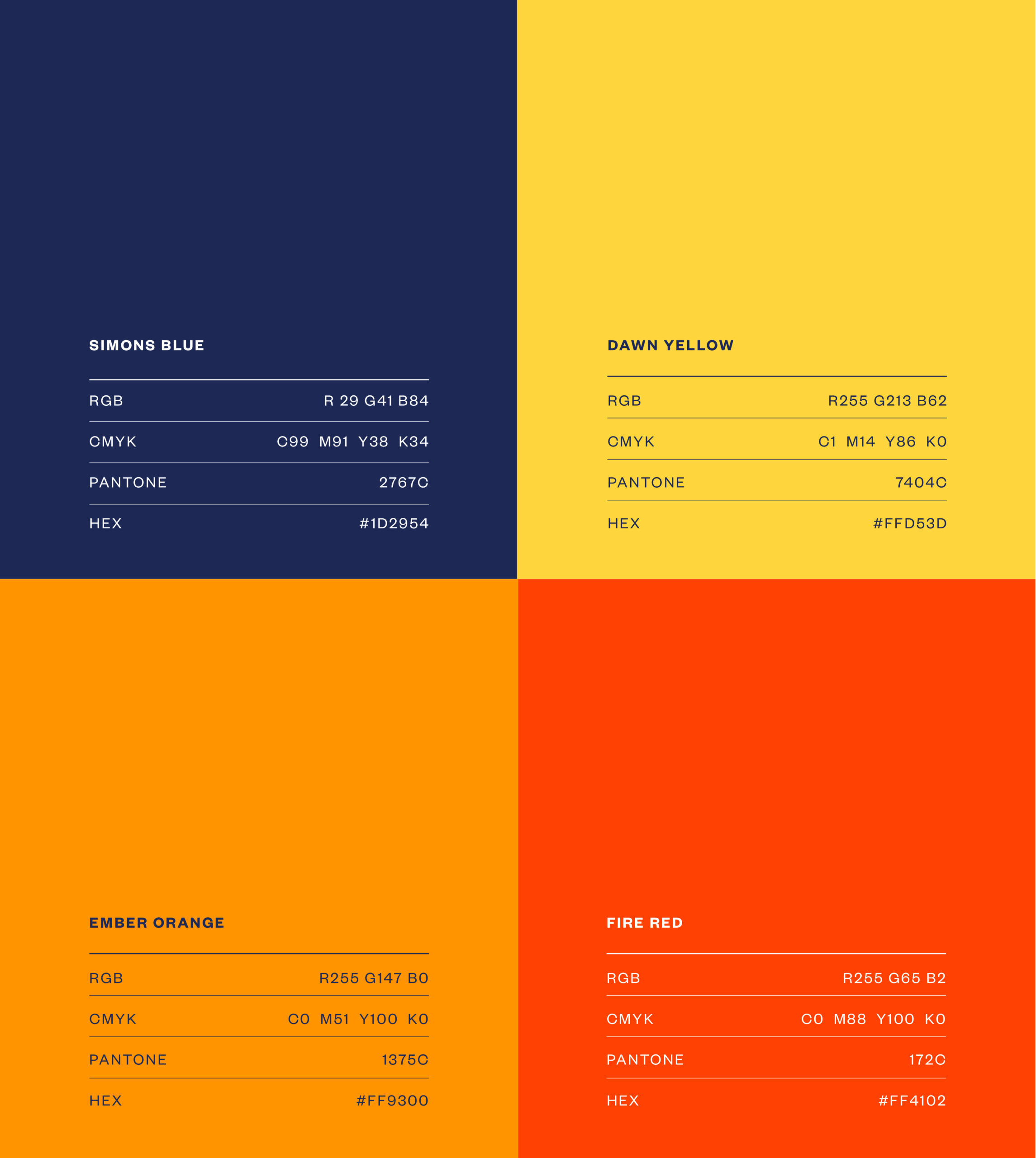
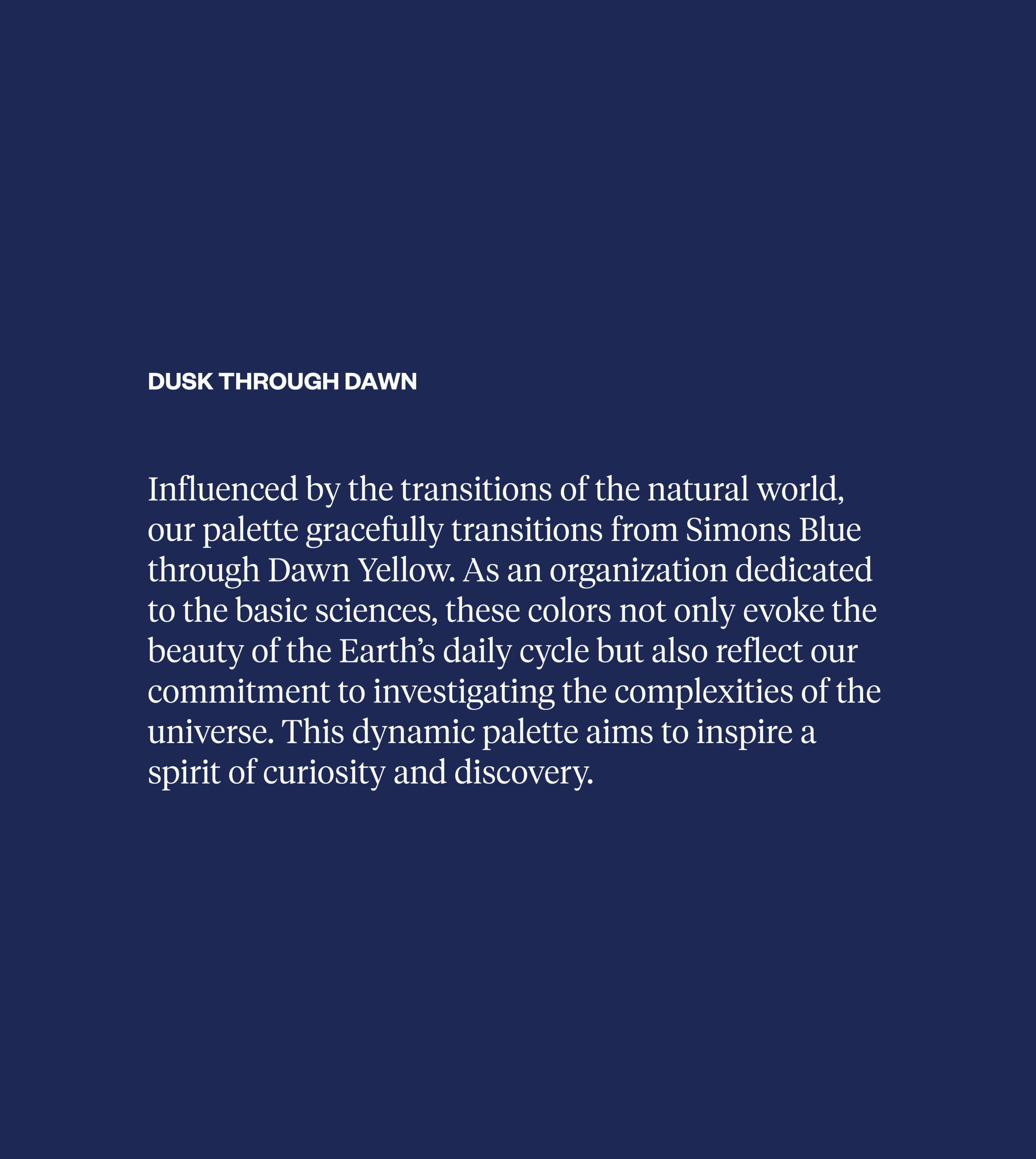
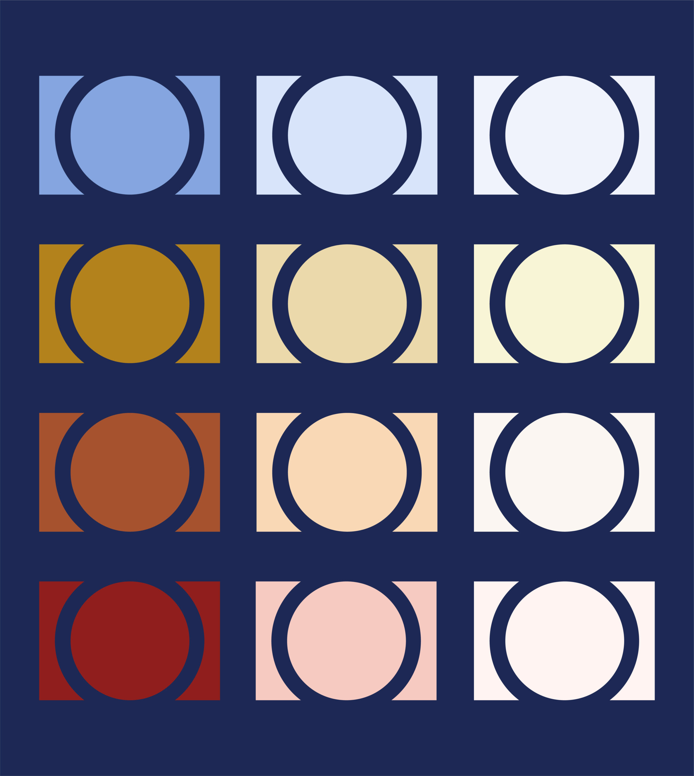
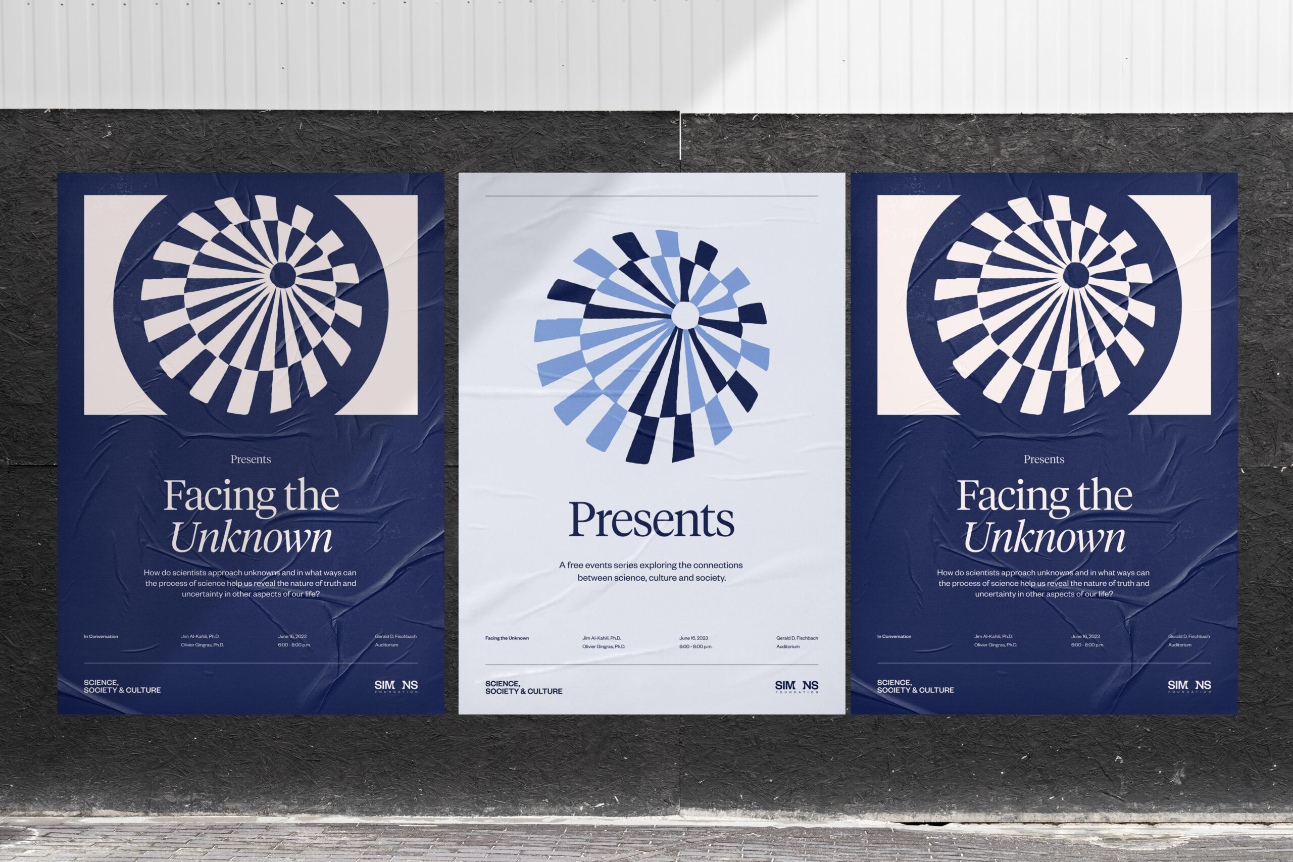
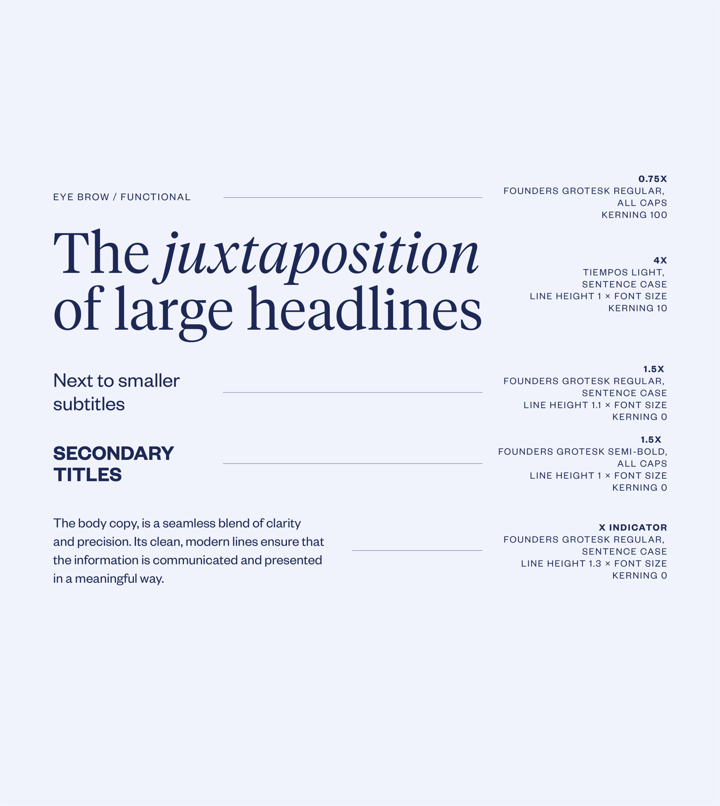
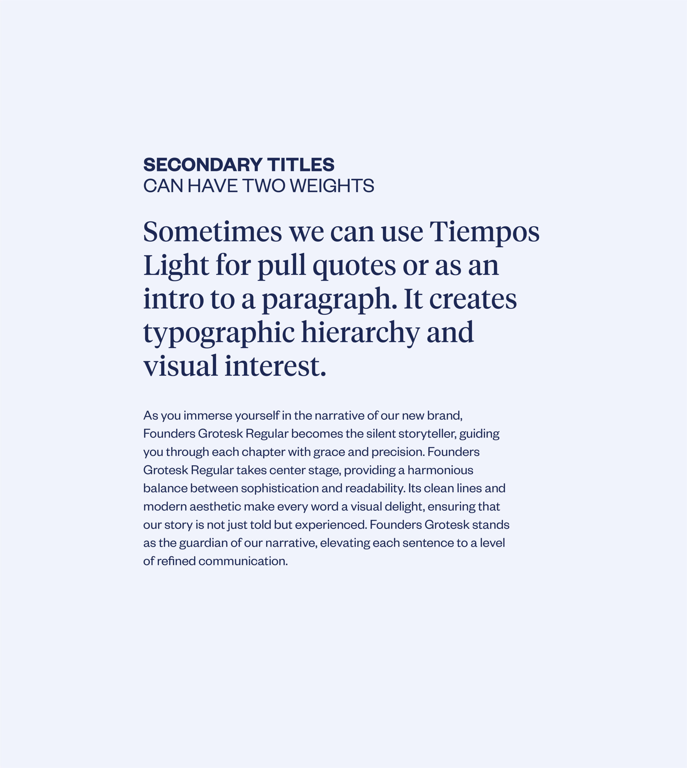
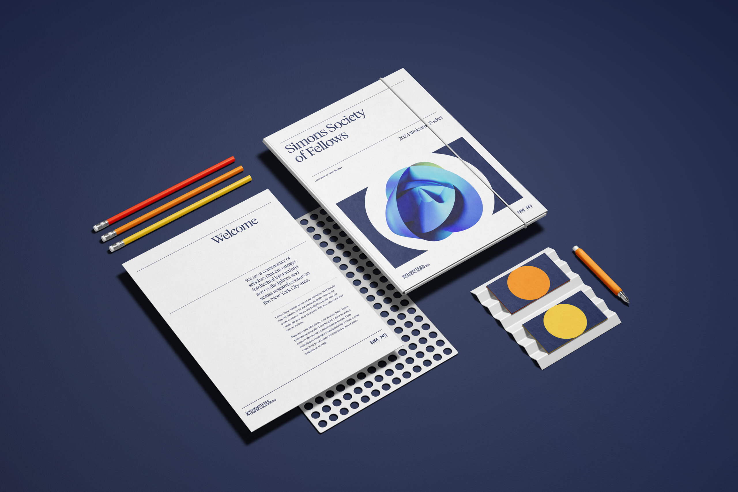
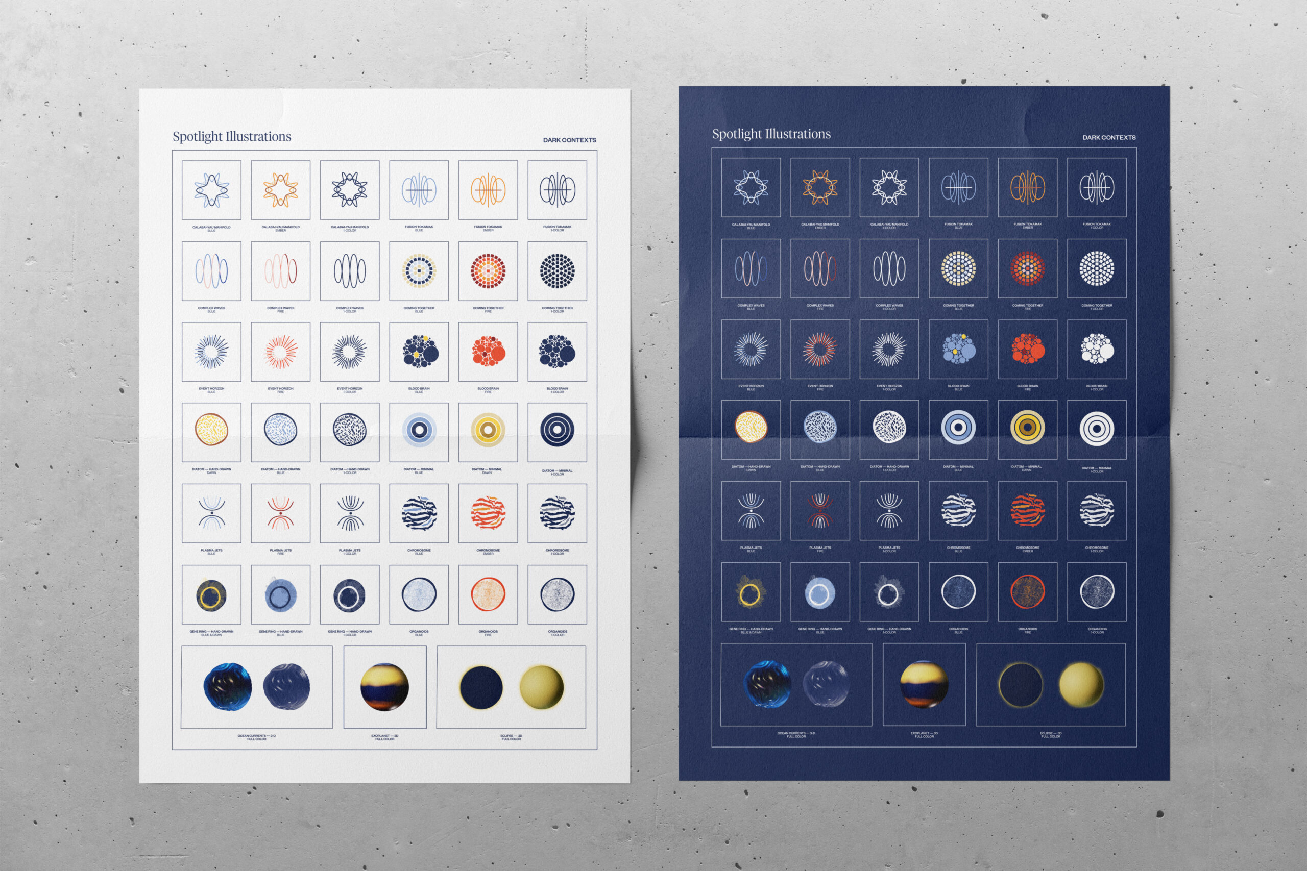
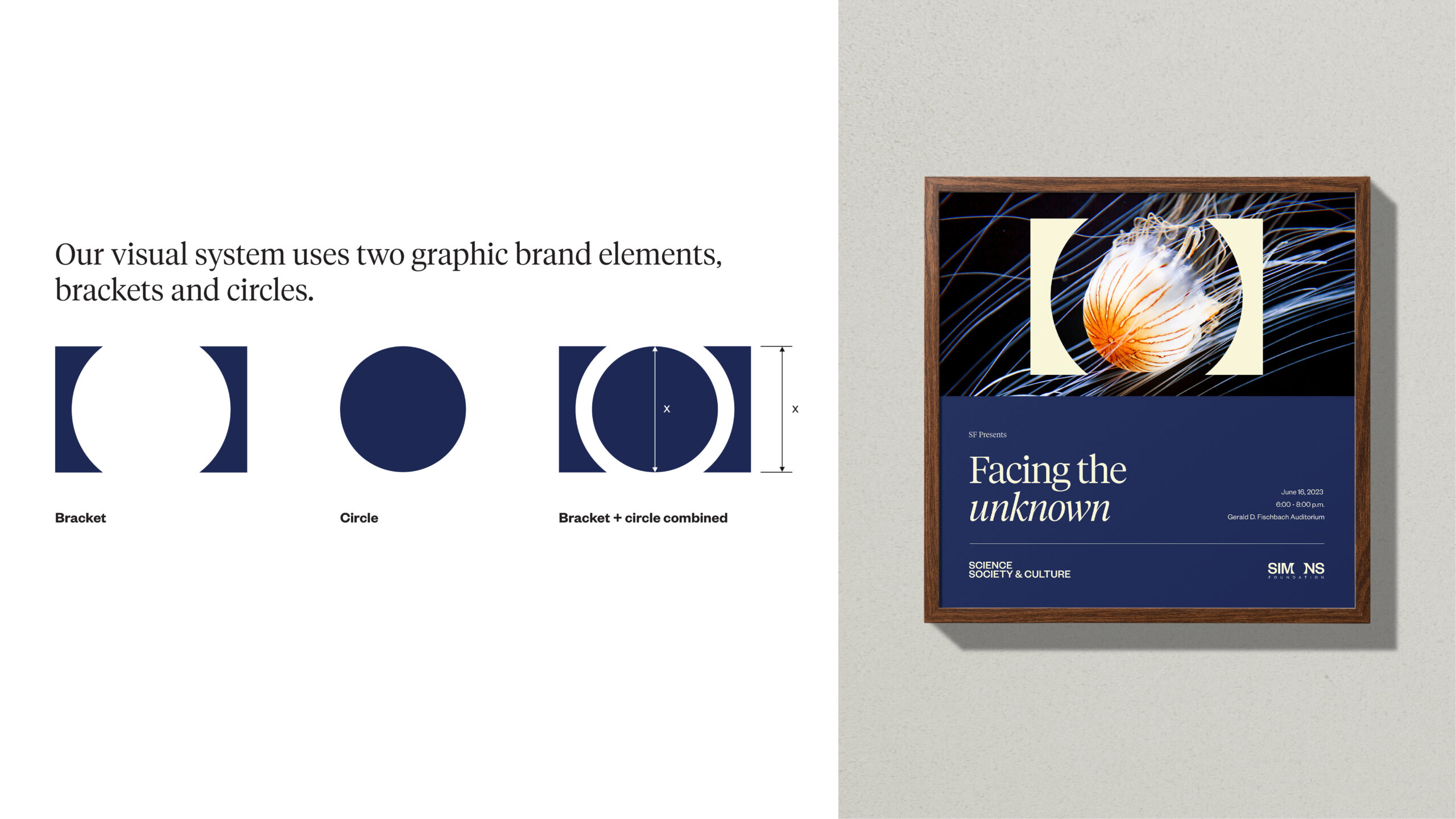
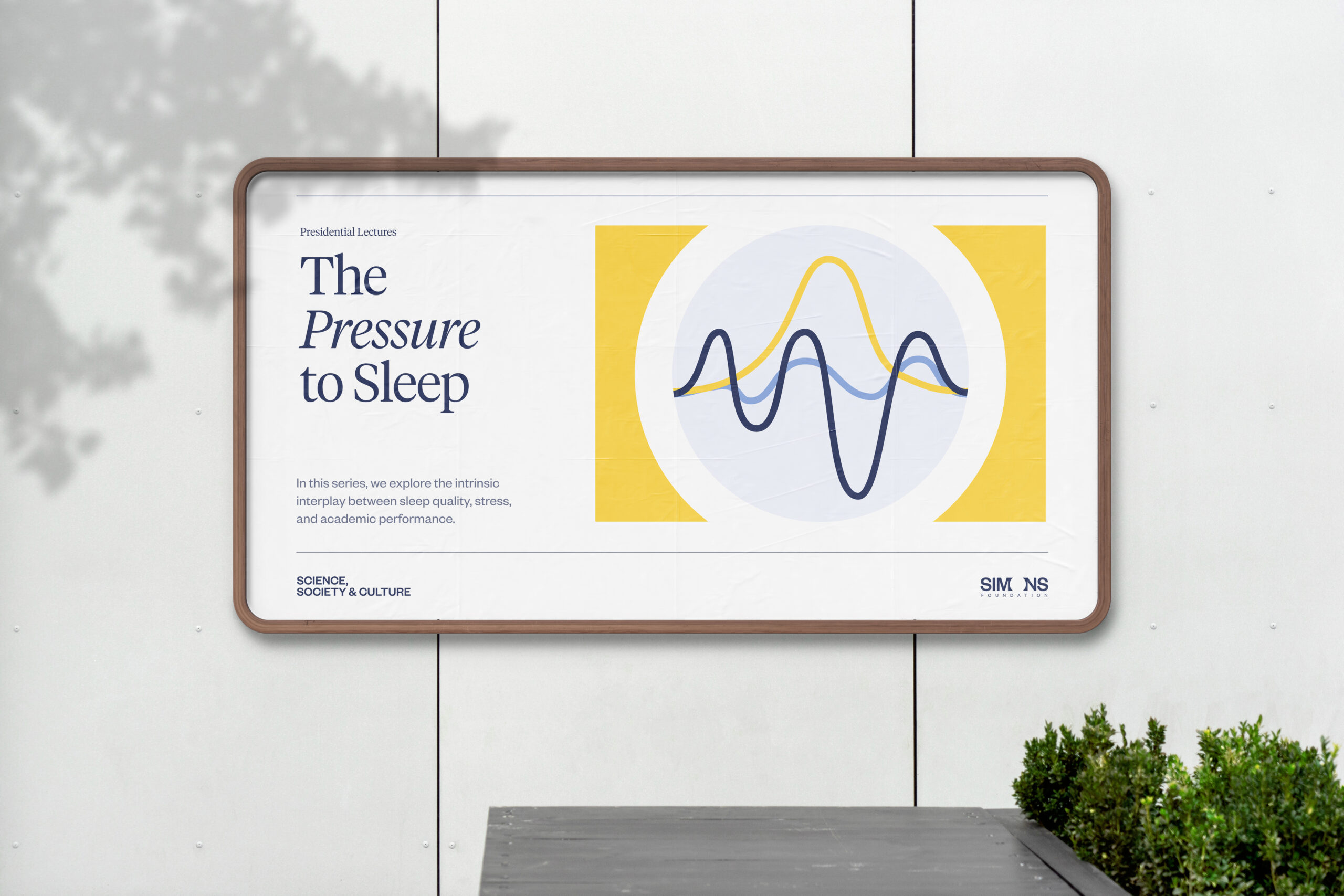
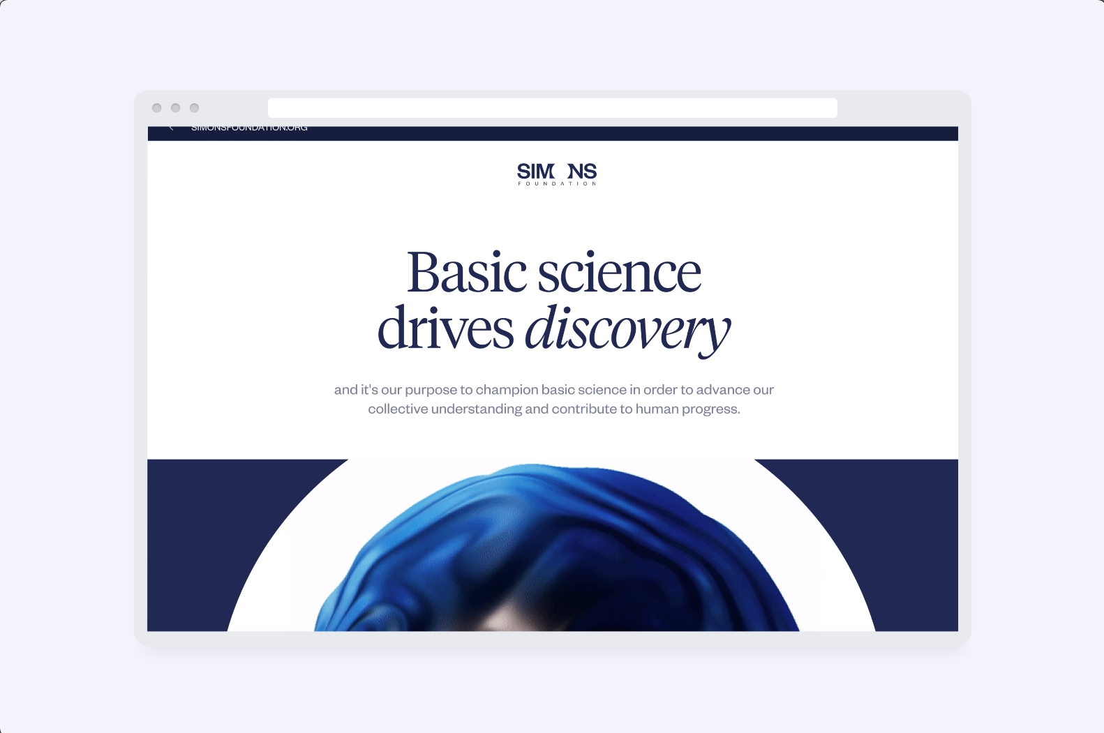
We created a dynamic brand system where bespoke illustration leads and the logo and wordmark flex to house that artwork for each program. A coordinated suite of original illustration, 3D forms, and motion behaviors gives every initiative its own visual voice while feeling part of the whole. A purposeful color architecture drives wayfinding between organizations and sub-brands. Editorial typography and layout rules create rhythm and readability without feeling clinical. Templates and guidance cover websites, publications, presentations, signage, social, and conference materials so teams can produce quickly and stay aligned.
Outcome
A cohesive presence across channels that still celebrates the individuality of each program. Navigation is clearer, production is faster, and the foundation now presents a unified, human, and visually rich brand to researchers, partners, and the public.